
A Digital IRB
Partners Healthcare
2013 - 2016
As a designer at GoInvo, I led a design team who worked on the Partners Healthcare IRB system Insight to architect more efficient workflows, introducing usability best practices and guided experiences to minimize errors in the submission process and increase approval turnaround rates. With these new UX patterns, our team established the foundational design system for the rest of the larger Insight application.
Background
Institutional review boards (IRBs) stand as gatekeepers of medical research, reviewing and ensuring proposed studies are ethical and legal, as they will eventually have a direct impact on long-term patient outcomes. Partners Healthcare, as the largest provider network in Massachusetts, requires all Partners-affiliated investigators to submit their studies and have them approved by the Partners Human Research Committee (PHRC). Insight, PHRC's electronic IRB portal, is the central point of ingest and administration for medical research for six major research institutions. The software and processes suffered from serious usability issues that would impede turnaround times and delay research for weeks or months.
Process
In-depth, in-person interviews
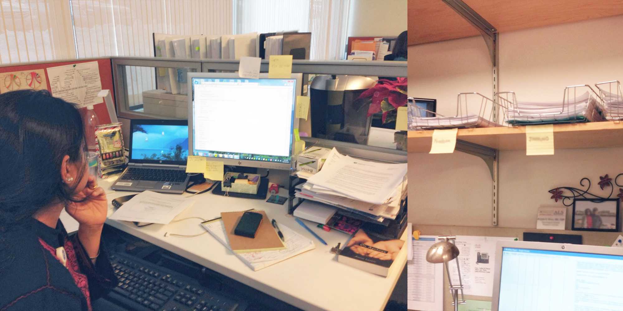
To begin with a thorough understanding of how the current IRB system worked and identify the depth and breadth of problem areas, the GoInvo team conducted a preliminary round of in-depth interviews, with 65 individuals at 6 research facilities, each who had a hand in the protocol review process, as well as 19 individuals on the review side, from analysts to admins. We conducted group interviews, one-on-one shadowing, as well as walkthroughs of their common tasks and workflows. Investigating the end-to-end IRB process allowed us to develop an appreciation for and an in-depth understanding of the people for whom we were designing, how they thought about their work, and the tools they used to get it done.
We interviewed IRB reviewers, people at Partners Healthcare with clinical or administrative backgrounds tasked with inspecting protocols for errors or signs of unethical research and ultimately responsible for signing off on the protocols. Many of the reviewers, expedited reviewers in particular, spend a significant amount of their lives within Insight —at least five days a week, eight hours a day, often much more— working with tools that, unfortunately, did not support an efficient review process. On a typical day, a reviewer might need to examine dozens of studies, working closely with the frequently frustrated research teams who were trying to push their protocol through, and keeping track of recommendations and instructions for each of these studies over the course of the entire process, which could span several weeks.
Our interviews included key stakeholders made up of research team members, not always clinicians or research scientists themselves; often they were staff who supported administration or assisted the PI, principal investigator. This role is often filled by research fellows, meaning there would be a high turnover rate with fresh faces every season, and a need to get acquainted with the study and tools in a short period. They would work with multiple protocols from different teams of the same department and needed to collect all the relevant materials and information as part of the submission process, a time-consuming and frustrating activity in and of itself.
We returned to the groups at key points during the design process to collect feedback on our process, pivot when necessary, and learn more about the IRB as new challenges came up. We also worked closely and regularly with analysts assigned to each reasearch module at Partners Healthcare during the design process. In the end, we had a system design fully vetted and validated by the very people who are in it every day that clarified a decades old paper process to a digital format.
Solution
Starting with Insight’s most complicated research module, Humans, our goal was to reduce friction between reviewers and submitters in addition to shortening the time it takes to prepare, submit, review, and push a protocol to approval.
Make protocols easy to locate based on open tasks
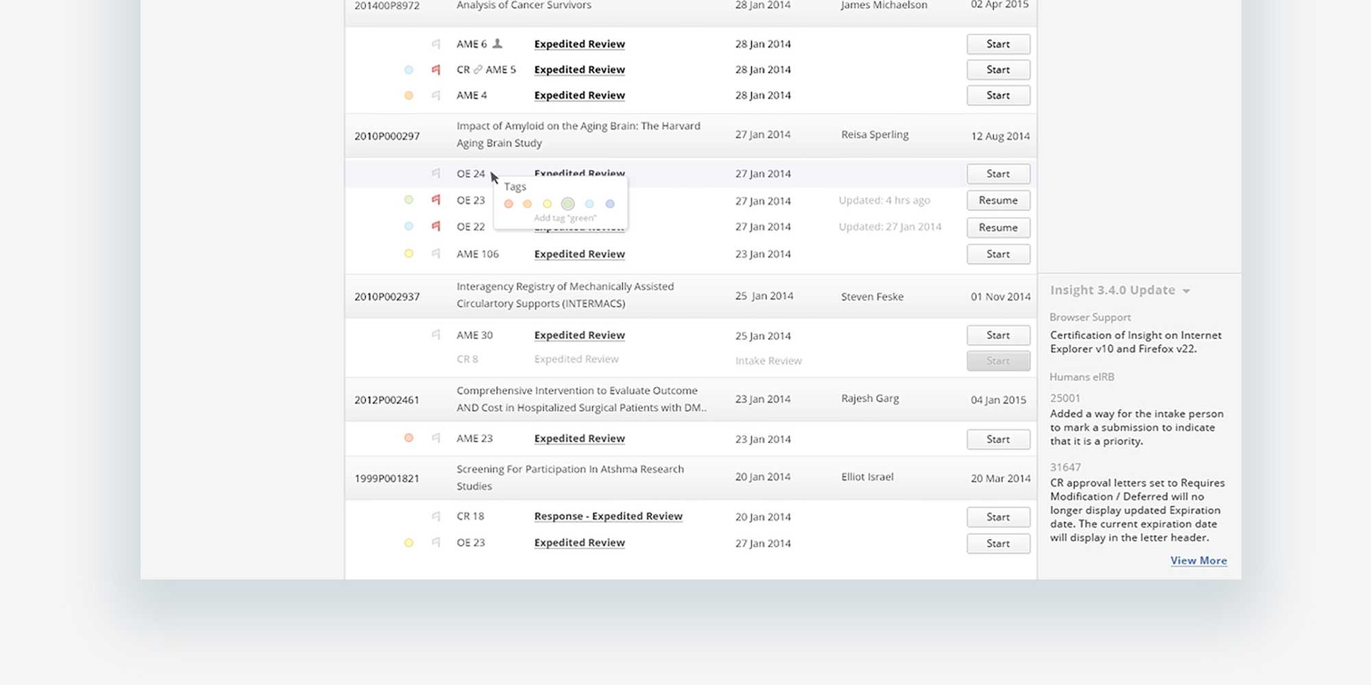
While Insight supported the idea of a protocol as a task to be performed by a reviewer, it did little to address the submitter’s mental model of protocols constituting a project or body of research. Upon logging in for the first time, submitters saw, not their own projects, but the protocols for an entire department or larger, based on the level of access. Researchers or administrators would have to search for their specific protocol by system ID number or titles usually a long and complex description of the study itself.
When a submitter or reviewer logged into Insight, they would want to immediately initiate a protocol or pick up where they left off. The protocol list, dense and populated by all protocols available by access permissions, didn’t make it apparent what protocols you worked on most recently or need attention. To find the protocol you’re interested in, you would need to search by protocol ID number, usually long and not something a submitter mentally associated to a study. To both improve the location of protocols and support the idea of protocols making up a body of research, we grouped protocols by study, sorting them from most recently updated, and using color to indicate status, highlighting protocols in need of attention, improving response time from both the submission and review teams to keep a protocol moving through the IRB, closer to approval. Older protocols or protocols submitters didn’t work with fall to the bottom and out of the way.
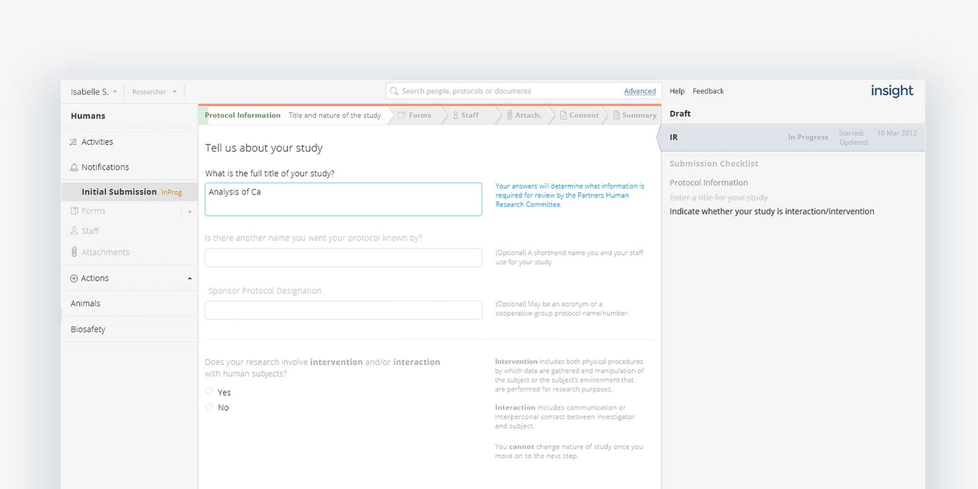
Open up protocols and make all parts navigable
The initial human research application was lengthy and could grow based on responses. Submitters had a difficult time parsing the language used in questions and instructions, feeling as if they were decoding a puzzle, which added to confusion, often leading to errors or missing information. Troublesome language wasn’t limited to just the protocol submission, but made it difficult to understand where to find certain things or identify next steps.
Protocol information was fragmented, with different parts hidden under multiple layers in multiple locations. Reviewers and submitters alike would often spend a lot of time hunting for specific pieces of the protocol.
While we were not able to reduce the number of questions and required material in the submission forms, the questions and instructions make use of concise, clear language, following typographic best practices for ease of scanning and readability, paired with contextual help along the way. The application itself is open, navigable to different parts or levels at any point in the submission or review process. Listing forms and marking as they are completed visibly tracks progress as well as sets expectations for the lengthy application, as well as allowing changes or comments to be made in the iterative review process, as the protocol evolves over time.
Support mental models of research and review
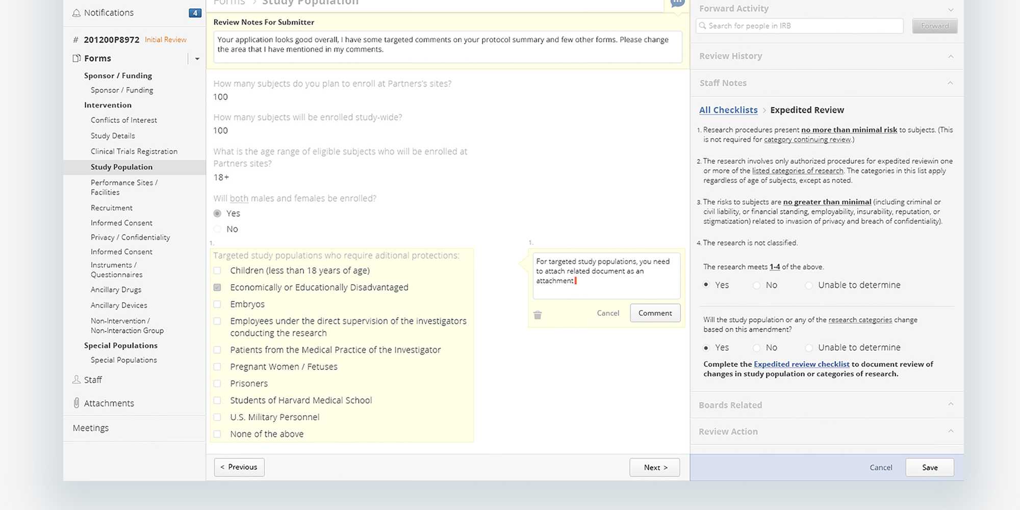
The act of submission and review was often an iterative back and forth process, requiring the ability to check previous review notes or comments made in the correspondence, but were not easily accessible or in context. Changes to a protocol were not visible, and a side-by-side comparison was not available. Reviewers got around this by opening up the previous version in a new window to compare against the current version line by line, increasing the time it took to perform a basic review.
A challenge for the research team was not knowing where their protocol was being held up in the process or why. Making the step and status of a protocol clear and immediately identifiable eliminated both a source of stress and a barrier to improved relationships. Submitters were able to see where their protocol was from the protocol list to the protocol detail itself and dig into the play-by-play history of submission and review, of who had it and when.
Contextual communication on the path to approval
Another cause of tension between the submission and review steps was the lack of clarity around recommended changes. Reviewers left enumerated changes in a text area attached to the protocol as a letter, referencing areas suggested changes should be made, often in different areas of the submission form. Submitters would have to decipher the comments and hunt for the problematic areas. Allowing reviewers to make comments where changes were needed and marking where comments were made in the protocol navigation, reduced significant mental stress and time spent for submitters, and allowed for clearer communication back and forth between submission and review.
Clear and documented historical views
Versioning and the ability to access previous instantiations of the protocol went a long way to improving the review process, allowing both reviewers and submitters to view previous versions of the protocol, what changes were made and why. Changes and comments are marked clearly in the protocol navigation, reducing the need to hunt even in a retrospective view.
A community of participatory design
In returning to the same groups of reviewers and submitters, occasionally pulling in fresh voices each time, we spoke with 91 individuals overall, collected feedback on the designs and were able to work through tricky situations thanks to their input. During final presentations of the new Insight system, participants came away feeling that they’d been heard and had a responsible part in the design.
As part of participating in the development, we created an inventory of all the screens, cataloged base components and reusable styles and consulted on front-end engineering, UAT, and QA. Currently, Insight 4.0 is now being rolled out to all of Partners research facilities.